
-
NEON SIGN SIZE GUIDE - CHOOSE THE PERFECT SIZE, SHAPE & COLOUR
CREATE YOUR CUSTOM NEON SIGNWelcome to the ultimate Neon Sign Size Guide, designed to help you confidently choose the right dimensions, shape, and colour for your neon sign.
Whether you're planning for a home, event, or business setting, this guide focuses on how size affects visibility, placement, and overall impact within a space.
📏 SIZE & SCALE — how dimensions relate to wall space and surroundings
🧱 PLACEMENT CONTEXT — positioning within rooms, backdrops, or feature areas
👁️ VISUAL IMPACT — ensuring your sign is clearly seen without overpowering
🎨 COLOUR & CONTRAST — how colour choice affects visibility at different sizes
Use this guide as a reference for making confident sizing decisions before installation.
Use the Custom Neon Sign Builder to test different wording lengths, layouts and dimensions before ordering. -
WHY SIZE REALLY MATTERS
UPLOAD YOUR NEON DESIGN IDEAChoosing the right size is one of the most important factors in how a neon sign looks and performs within a space.
⚖️ BALANCE & PROPORTION — too large can dominate, too small may get lost
👁️ LEGIBILITY & VISIBILITY — size directly affects how easily text can be read
🧱 SPACE COMPATIBILITY — the sign should fit naturally within its surroundings
🎯 OVERALL IMPACT — the right size creates a clear and effective focal point
Getting the size right helps ensure your neon sign feels intentional, well-placed, and visually effective.

-
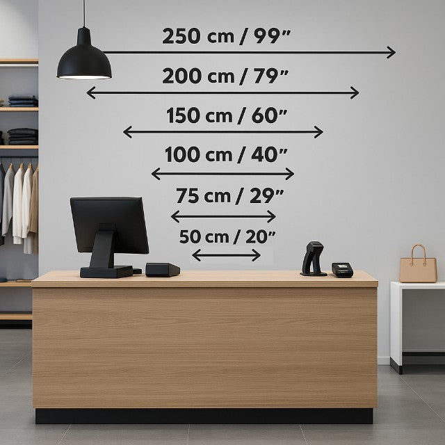
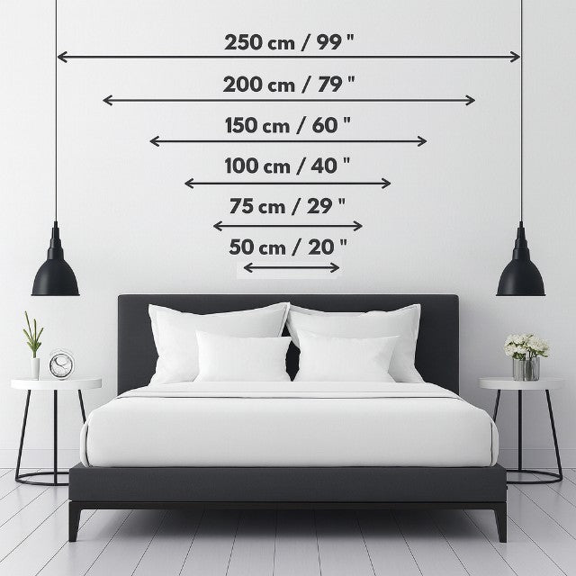
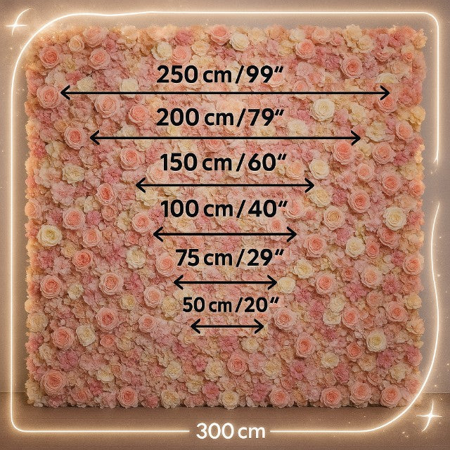
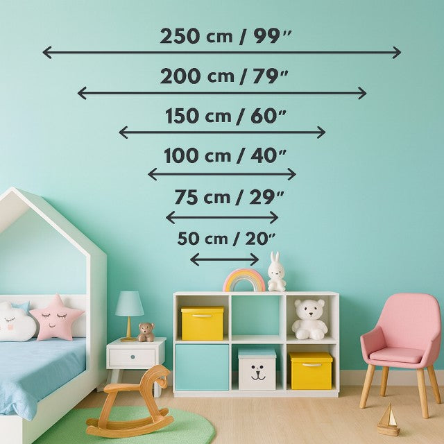
HOW TO CHOOSE THE RIGHT SIGN FOR YOUR SPACE
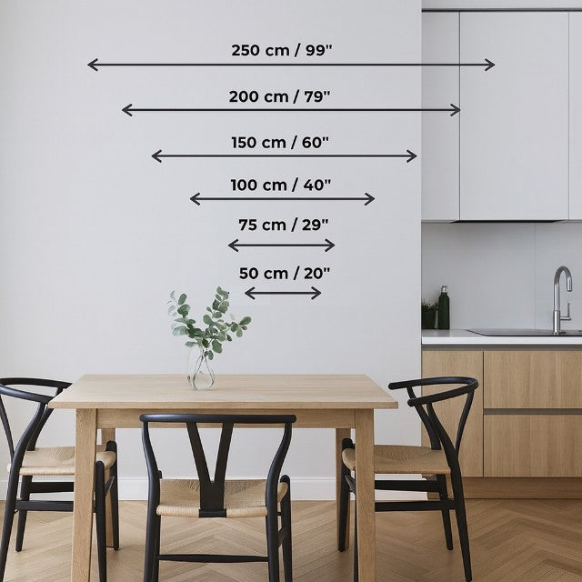
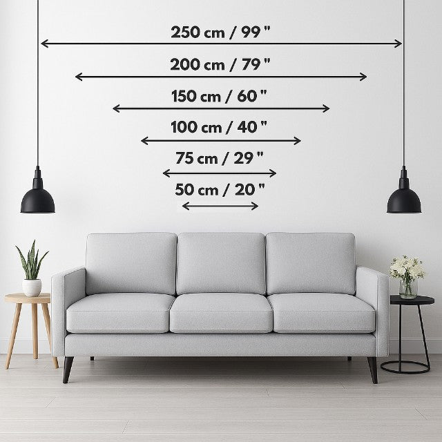
VIEW REAL ROOM EXAMPLESChoosing the right size starts with understanding your available space and how the sign will sit within it.
📏 MEASURE YOUR WALL — use a tape measure to confirm width and height
🧱 ALLOW FOR BREATHING SPACE — leave space around the sign so it doesn’t feel cramped
🧩 VISUALISE THE SCALE — use masking tape or paper outlines to map the size
⚖️ BALANCE & PROPORTION — avoid placing signs too close to shelves, frames, or edges
📐 TEXT & DESIGN LENGTH — longer wording may require wider layouts or multiple lines
🔄 ORIENTATION — horizontal for wider walls, vertical for narrower spaces
🖼️ MOCKUP TIP — previewing size against your wall helps reduce guesswork and improves accuracy
Taking time to assess placement and scale helps ensure the sign fits naturally within the space.
Different placements and environments can dramatically affect how large a sign appears once installed. -
SHAPE & FORM: WHY SHAPE MATTERS
The shape of a neon sign influences how it fits within a space and how clearly it can be seen.
◻️ RECTANGLE / SQUARE — clean, space-efficient, and ideal for text-based designs
⚪ CIRCLE / OVAL — softer visual feel, often used for decorative or feature pieces
⭐ CUSTOM OUTLINES — more expressive shapes that may require additional space
⚠️ DETAIL & CLARITY — more complex shapes can lose definition at smaller sizes
📏 SCALING CONSIDERATION — increasing size helps preserve detail and readability
Choosing the right shape supports both placement and overall visual clarity.
CUSTOMER REVIEWS
Interested in what out customers are saying about our products and service? See real reviews below.
-
COLOUR & CONTRAST: PICKING NEON COLOURS THAT POP
VIEW NEON COLOUR OPTIONSColour plays an important role in how visible your neon sign appears at different sizes. The right contrast helps ensure clarity across varying lighting conditions and backgrounds.
🎨 DARK BACKGROUNDS — lighter colours such as white, cool white, or light blue create strong contrast
🧱 LIGHT BACKGROUNDS — darker or more saturated colours improve visibility
⚖️ LIMIT COLOUR CLUTTER — fewer colours can improve readability, especially at smaller sizes
🌡️ WARM VS COOL TONES — warmer colours draw attention, while cooler tones feel softer and more ambient
Choosing the right colour helps maintain clarity and visual impact across different sizes and environments.
Explore different Neon Sign Colours to compare brightness, contrast and visibility across different environments. -
VIEWABILITY & VIEWING DISTANCE GUIDELINES
Different spaces require different neon sign sizes. Use these examples as a guide to understand how scale works across various environments.
🛋️ LIVING ROOM —
80–150 cm for feature walls or above sofas
Larger sizes (150 cm+) for statement pieces
🛏️ BEDROOM —
60–100 cm for above beds or wall accents
Smaller sizes for subtle, ambient styling
🏢 OFFICE / WORKSPACE —
60–120 cm for desks, reception areas, or branding walls
Larger signs for open-plan or shared environments
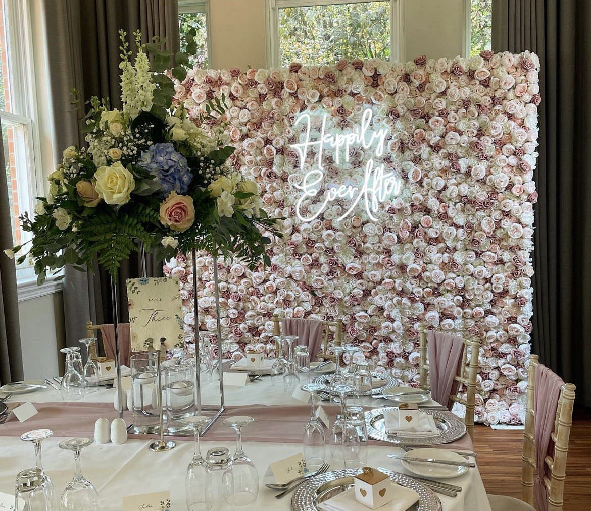
🎉 EVENTS & BACKDROPS —
100–200 cm depending on backdrop size and viewing distance
Larger signs improve visibility in photos
🏪 RETAIL & STOREFRONTS —
120 cm+ for window displays and street visibility
Larger formats for long-distance readability
Matching the size to the room helps ensure the sign feels balanced and clearly visible.

CHOOSE YOUR SIZE BY ROOM
Choose your setting from our handy size calculation tool below. Use the images to identify which size sign is best for your space and setting.
-
SAMPLE USE-CASES & ROOM BY ROOM SUGGESTIONS
EXPLORE ROOM DECOR IDEASDifferent spaces require different neon sign sizes. Use these examples as a guide to understand how scale works across various environments.
🛋️ LIVING ROOM —
80–150 cm for feature walls or above sofas
Larger sizes (150 cm+) for statement pieces
🛏️ BEDROOM —
60–100 cm for above beds or wall accents
Smaller sizes for subtle, ambient styling
🏢 OFFICE / WORKSPACE —
60–120 cm for desks, reception areas, or branding walls
Larger signs for open-plan or shared environments
🎉 EVENTS & BACKDROPS —
100–200 cm depending on backdrop size and viewing distance
Larger signs improve visibility in photos
🏪 RETAIL & STOREFRONTS —
120 cm+ for window displays and street visibility
Larger formats for long-distance readability
Matching the size to the room helps ensure the sign feels balanced and clearly visible. -
COMMON MISTAKES & TIPS
VIEW LED NEON SIGN INFORMATIONAvoiding common sizing mistakes helps ensure your neon sign looks clear, balanced, and effective.
Mistakes to avoid:
❌ Choosing a size that is too small for the space
❌ Using complex fonts at small sizes
❌ Ignoring wall/background contrast
❌ Forgetting space for wiring or installation
Tips:
✅ Always visualise size before ordering
✅ Leave space around the sign for balance
✅ If unsure, size slightly larger for better visibility
✅ Choose simpler fonts for smaller signs
Taking these steps helps ensure your sign is both visually effective and easy to install.
-
NEED HELP VISUALISING YOUR NEON SIGN SIZE?
If you're unsure which size works best, taking a moment to visualise the scale within your space can make a big difference.
📏 USE WALL MARKINGS — outline the size using tape or paper
🧱 COMPARE WITH FURNITURE — measure against sofas, beds, or counters
👁️ STEP BACK & REVIEW — check how it looks from typical viewing distance
📸 TAKE A PHOTO — helps you assess balance and placement more clearly
These simple steps can help you choose a size that feels accurate, balanced, and well suited to your space.
NEON SIGN SIZE GUIDE - FREQUENTLY ASKED QUESTIONS
Read these to help get the right fit for your space:
Explore broader guidance covering installation, delivery, sizing and warranty in our LED Neon Sign Information hub.
Collapsible content
What size neon works best in a living room?
For most living rooms, a 45–60 cm (18–24″) width looks balanced above a sofa or TV unit.
If you’re creating a true focal wall, ~90 cm (36″) delivers more presence without overwhelming the space.
Measure the wall and leave 10–20% margin around the sign so it can “breathe”.
If your design is tall (stacked text or a logo), consider sizing by height rather than width to maintain readability.
How do I measure my wall so I don’t order too small or too big?
Measure the total available width/height with a tape, then mark a rectangle on the wall using low-tack tape or paper.
Step back to typical viewing distance and check the balance with nearby frames, shelves and windows.
As a rule, aim for a sign that occupies 60–70% of the width of the area you want it to fill (e.g., above a sofa or console).
How big should the letters be for good readability at distance?
A reliable rule of thumb is: letter height (cm) ≈ viewing distance (m) ÷ 10.
Examples:
- 2–3 m away → letters 5–6 cm tall
- 5–10 m away → letters 10–15 cm tall
- 10 m+ away → letters 15–25 cm tall
If you’re using a script font with thin strokes, size up slightly to keep letterforms clear.
How many letters fit into 90 cm (about 36″)?
It depends on the font and spacing, but 6–10 characters is typical for 90 cm in a flowing script.
Blocky, condensed fonts fit more; wide scripts fit fewer.
Multi-word phrases usually work best across two lines or at a wider size so ascenders/descenders don’t collide.
Should I choose my size by width or by height?
We always quote our neon signs by width first.
For logos, monograms or stacked layouts, choose by height to maintain legibility.
If in doubt, ask for a mockup on a photo of your wall before ordering.
What shapes/backings help readability?
A simple rectangular or contour-cut clear acrylic backing keeps the focus on the design.
Minimal backgrounds and tidy line spacing boost clarity.
If your logo has fine detail, increase the overall size or simplify thin strokes so they don’t visually “drop out” when viewed from across the room.
Which neon colours are most readable?
High-contrast colours against the wall work best.
On dark walls, bright tones (white, warm white, electric blue, neon pink) pop.
On light walls, choose stronger hues (hot pink, red, deep blue).
Limit palettes to 2–3 colours to avoid visual noise.
Pale pastels look beautiful but often need a larger size for the same legibility.
Will the sign be too bright at night? Can I dim it?
Yes—use your free remote dimmer to tailor brightness for evening use or photography.
Dimming also helps cameras avoid blown highlights and banding.
For bedrooms and home bars, most customers end up using 30–70% brightness day-to-day.
Can I install a sign without drilling?
For temporary installs (events, rentals, flower walls), hang from top holes using clear wire/chain or cable ties to a frame. For permanent walls, standoff mounts give the cleanest, safest result.
Always route the cable neatly and avoid pinching the LED flex.
Can I use a neon sign outdoors or in a shop window?
Yes, but specify outdoor-rated construction and plan for weather protection.
Go larger for street-side readability (120 cm+ is common for shopfronts).
If required, add waterproofing. This includes a waterproof power supply, and be mindful of reflections/glare from glass if the sign sits in a window.
How long should the cable be and how do I hide it?
Signs usually have a clear lead from the sign to the power supply, plus a mains lead to your socket.
If your socket is further away, request a longer lead or plan trunking/cord concealment.
You can choose cable exit (left/centre/right) to suit your layout—just ask before finalising the design.
What do you need for a logo or custom artwork?
Vector files (.AI, .EPS, .SVG) are ideal; high-res .PNG with a transparent background also works.
Very fine detail may need simplifying or upsizing to remain legible in LED neon.
We’re happy to preview a free wall mockup so you can confirm scale before ordering.
-
INSTALLATION & MOUNTING
SEE THE FULL INSTALLATION GUIDEHow a neon sign is installed can influence the size you choose. Larger signs may require more secure mounting and additional space for positioning.
🧱 MOUNTING SURFACE — ensure the wall or backing can support the size of the sign
📏 SPACING REQUIREMENTS — allow room around the sign for a balanced layout
🔩 FIXING METHOD — larger signs may require more secure mounting points
📐 POSITIONING HEIGHT — consider eye level and viewing angles when placing the sign
Planning installation alongside sizing helps ensure the sign fits safely and looks correctly positioned. -
POWER, DIMMERS & SAFETY
CREATE YOUR CUSTOM NEON SIGNPower setup and lighting control can also influence how a neon sign performs at different sizes.
🔌 POWER SUPPLY — matched to the size and configuration of the sign
💡 BRIGHTNESS CONTROL — dimmers can help adjust larger signs for different environments
🌡️ LOW-HEAT OPERATION — suitable for extended use across various settings
⚡ STANDARD CONNECTIONS — designed for compatibility with regional power systems
Considering power and brightness helps ensure your chosen size works effectively within the space.
RELATED INSPIRATION
Explore more about LED neon signs, including sizing, installation, delivery, and how they perform across different environments.
-
🔗 LED NEON SIGN INFORMATION
VIEW LED NEON SIGN INFORMATIONUnderstand how LED neon signs work, where they’re used, and key considerations before choosing your design.
-
🧾 NEON SIGN WARRANTY & GUARANTEE
VIEW WARRANTY & GUARANTEEUnderstand warranty coverage, support processes, and what to expect after delivery.
-
🛠️ NEON SIGN INSTALLATION GUIDE
VIEW INSTALLATION GUIDESee how neon signs are installed and positioned, and how this impacts placement and sizing.
-
📦 NEON SIGN DELIVERY INFORMATION
VIEW DELIVERY INFORMATIONPair text with an image to focus on your chosen product, collection, or blog post. Add details on availability, style, or even provide a review.
DON'T MISS OUT!
Join our mailing list and be amongst the first to receive special offers and discounts. Don't worry, we won't send endless messages - just the offers we know you're going to love!