
BEST SELLING CUSTOM NEON SIGNS
-
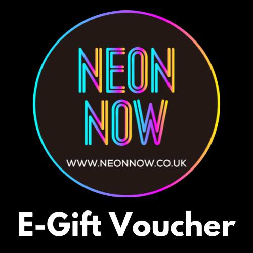
Gift Card for Neon Signs
Regular price From $13.55 USDRegular priceUnit price per -
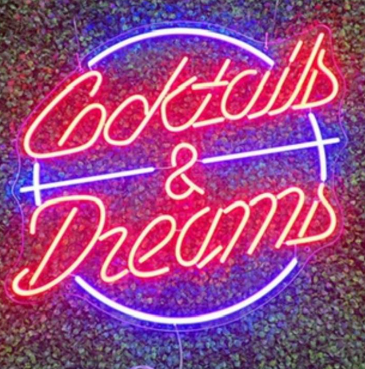
Cocktails & Dreams Neon Sign
Regular price From $406.00 USDRegular priceUnit price per -
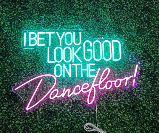
I bet you look good on the dancefloor Neon Sign
Regular price From $292.00 USDRegular priceUnit price per$419.00 USDSale price From $292.00 USDSale -
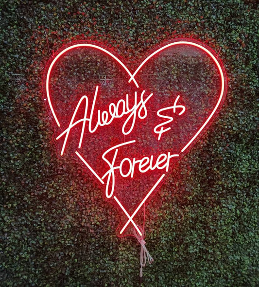
Always and Forever Neon Sign
Regular price From $473.00 USDRegular priceUnit price per -
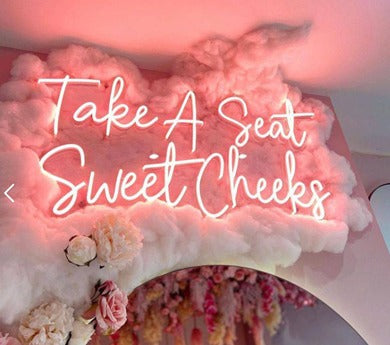
Take A Seat Sweet Cheeks Neon Sign
Regular price From $229.00 USDRegular priceUnit price per -
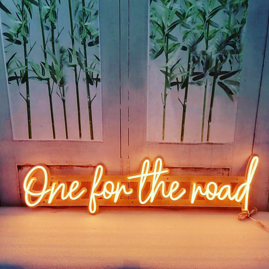
One for the road Neon Sign
Regular price From $229.00 USDRegular priceUnit price per -
Laundry Today or Naked Tomorrow Neon Sign
Regular price From $292.00 USDRegular priceUnit price per -
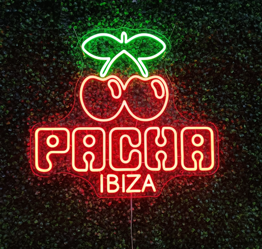 Sale
SalePACHA Neon Sign
Regular price $278.00 USDRegular priceUnit price per$406.00 USDSale price $278.00 USDSale


CUSTOMER REVIEWS
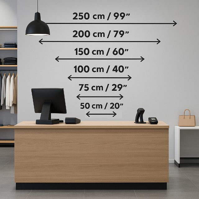
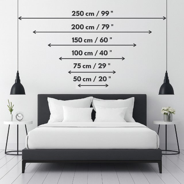
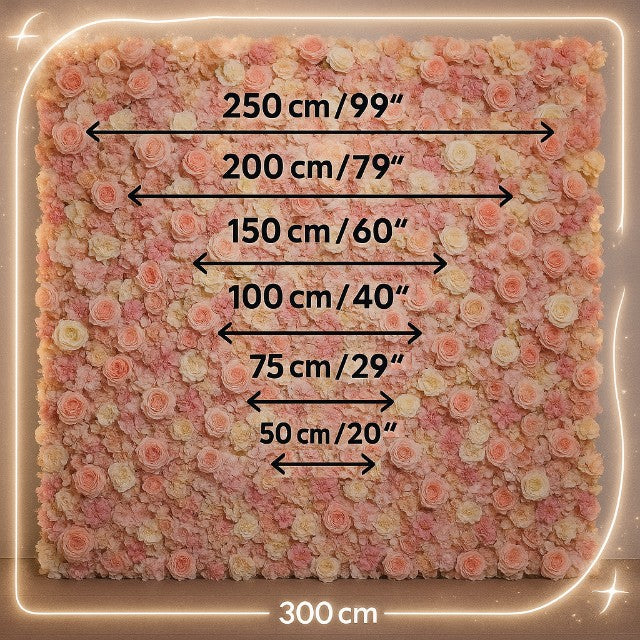
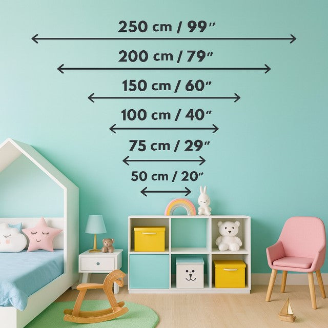
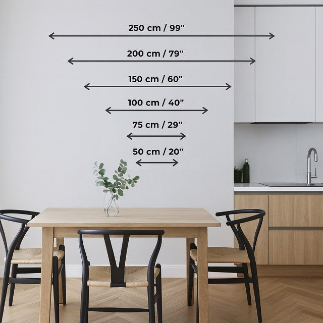
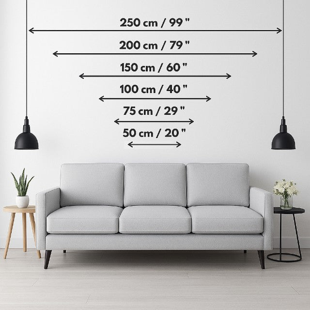
CHOOSE YOUR SIZE BY ROOM
BIG BRANDS TRUST NEON NOW
NEON SIGN SIZE GUIDE - FREQUENTLY ASKED QUESTIONS